(The site is for UX portfolio only and is not being maintained any more. If you want to see my recent personal updates, please visit my blog.)
Jobhax
Marketing Page
Challenge: User conversions drop off significantly on the landing page
Re-design: Unify product landing page, simplify sign-up/sign-in flow and customize setup.
Outcome: UX Design, 3-month-effort prototype, team of 1 eng, 1 PM and 1 marketing lead

BUSINESS GOAL
The business goal is to increase the signup conversion rate.
DESIGN GOAL
-
Improve the transparency, affordance, and engagement of the marketing page
-
Improve the discoverability of the sign-up CTA on the landing page
Sign up / Sign in
-
Improve the flexibility to change between sign-up and sign-in flow
-
Improve the PW success rate to sign in
Post-sign up
-
To collect more personalized data to inform preference setting
DESIGN
Problem Statement
original design
.png)
Users are not well-informed to make a sign-up decision. The landing page could use more visualization to present the user flow through our product and to increase transparency, affordance, and engagement with users in that way.

Competitor
Analysis
By providing a demo carousel, users understand how to use Trello to create cards and change between boards.


By providing the UI of the product in hero, users understand what the app look like easily.

DESIGN
Problem Statement

original design

Users are not well-informed to make a sign-up decision. The landing page could use more visualization to present the user flow through our product and to increase transparency, affordance, and engagement with users in that way.
Design
Solutions
After creating the prototype Version 1, we did a fast user test to see what usability issues arose. Then we made the change on the design according to some of the feedback.

Version 1 and users' feedback
Users noticed the CTA and were satisfied with it
Users thought the illustration was easy to understand

Users thought the tilt distracted them to read the image
Next step:
Make the image not tilted
Users didn't expect to see this in the first place because they were more curious about the tracking board
Next step:
Move this section down
Users liked to see repeated CTAs but were confused if they were clickable
Next step:
Make all sign up CTA consistent with the first CTA in hero
Users didn't understand how to see the next image
Next step:
Provide a prominent indicator (e.g., an arrow)
Version 2

1
Present the UI of the product upfront
2
Provide prominent and consistent CTAs
3
Leverage the carousel to provide more information
4
In the original design, eyes will focus on irrelevant elements. In the redesign, eyes will go over important info from the product, headline to the CTA.
Make both design blurry (before and after) to compare eye track / path for both
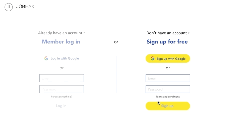
Version 3 (final)
I changed the accent color to blue and added a testimonial section.

DESIGN

Problem Statement


1
We can decrease the unnecessary mental efforts to switch between sign-up and sign-in. Now, sign-up and sign-in are separated entrances, which is not flexible for users who don't choose the right entrance at the beginning.


123456 ?
12345678 ?
12345678ABC ?
12345678AaBbCc ?
12345678AaBbCc@!~ ?
WHICH
ONE?!!!
2
Also, we can remind users about their password, narrowing down password sets by providing password requirements.
Design Solutions

1
Show 4 Options Upfront
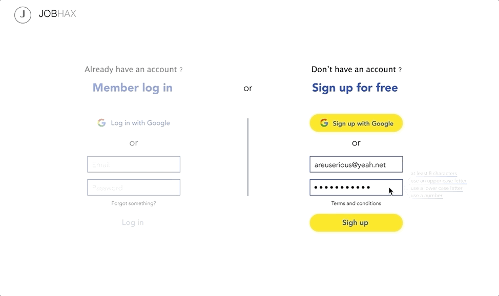
The sign-in and sign-up are combined to be one screen. The screen is divided into 4 sections:
Left side
1) Up: sign in with Google account
2) Down: sign in with email
Right side
1) Up: sign up with Google account
2) Down: sign up with email
2
Flexible Switch
Hover-over effects on both sides to let users know that they can change to either side flexibly.


... even though users have entered something on the other side
3
Password Hints for Sign In
Users will be able to see password requirement (same with what they used to set up their password) that helps them to narrow down possible password sets

DESIGN

Problem Statement
Users may be on the different stages of job hunting, so their tracking board should be customized according to their situation. We can survey what users are experiencing in the hiring process right after sign up.
Competitor
Analysis
OkCupid - By asking users several questions about their preferences right after new users sign up, it collects users' expectations on the dates and matches compatible dates for them accordingly.

Design Solutions


After a new users sign up they will see a pre-questionnaire. By clicking on "Next", they will answer 3 questions.
1
User's Name
2
User's Email(s)

Users can add additional emails
3
User's Progression

Users can choose multiple options
SKETCHES & PROTOTYPE

Original design
Wireframe


Redesign


Original design


Wireframe


Redesign

Wireframe

Final design