(The site is for UX portfolio only and is not being maintained any more. If you want to see my recent personal updates, please visit my blog.)
Jobhax Dashboard

Product: To import application status from the email account to the dashboard and track the application progress
Challenge: Resolve primary usability issues and organize information architecture
Design: Applied user-centered design principles to critical user journeys; Applied a modern design.
Outcome: UX Design, 2-month-effort prototype, team of 1 eng and 1 design lead
DESIGN GOAL
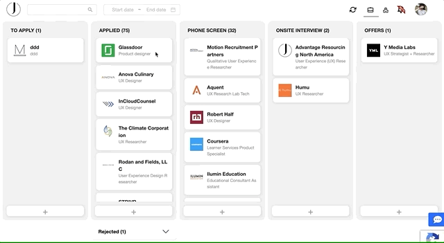
The overall goal is to increase the usability of dashboard 1.0. I break it down to a few critical user journeys (CUJs) and then come up with design solutions with my team.
Home
-
Present all categories clearly, present necessary information on each card
Add a card
-
Make sure adding feature is easy to discover and not distracting as well
Move a card
-
Provide adequate feedback when users moving a card
Search and filter
-
Provide search features to enable users to look for certain job cards

DESIGN: Brand


DESIGN: Home
Design
The new dashboard is created to catch the blank design trend - white out less important information and make important elements (e.g., titles, job cards, add card CTA) look more prominent and be easier to access.

In version 2, the CTAs are moved to the bottom of each column.
Version 2 (CTA on the bottom)

However, according to our evaluation and users' feedback, the pop-up box was far from the CTA, which was disconnected to the CTA.
Challenge: How to make the interaction more connected while minimizing distracting users from the rest of the content?
Solution 1: Add an animation to highlight the connection


Solution 2: Move the pop-up box to the bottom nearby the CTA

Final solution: Move the CTA to the top right corner with smaller size; Retain the pop-up box on the top

CTA: Blue or white?


DESIGN: Move a card
Problem Statement
Moving a card from one box to the other indicates the change of the application status (e.g. from "applied" to "phone screen" status). There was no feedback provided when users dragging a card from one box to the other, which may lead to some error to finish the task.
DESIGN: Add a card
Design
In version 1, the “Add a card” CTA was on the top of the first card. However, it caught too much attention at spots of highest attention.
Version 1 (CTA on the top)
%402x.png)
Design
When users dragging a card, the background color of all available boxes turned blue to indicate that they are ready to receive the card. When the card is dragged onto a certain box, the background color of the box turned to dark blue to indicate that the card will be put into this box.
DESIGN: Search and filter
Problem Statement
The discoverability of a card is important. Without the search box, users have to scroll down or use control + F in order to find an application card, which is not a delighted experience.
Design
I designed a search bar and a filter especially for searching applications in a certain timeframe. Considering the technology barrier, we didn't launch other filter criteria and we want to see what this filter performs, how users like it before launching more filters.