(The site is for UX portfolio only and is not being maintained any more. If you want to see my recent personal updates, please visit my blog.)
Alarmen
After the 10th time that I set up an alarm on PM whereas it was supposed to be AM on Apple default alarm, and the 20th time I stopped the alarm whereas I was supposed to snooze, I decided to design my own alarm that is error-free. Although the functionality is simple, I applied user-centered design to make it stand out from many competitors. This is a project that spanned for 2 months from competitor analysis to usability test.
Role: UX/UI Designer
Problem
1
Active alarms are not standing out
AM and PM are not differentiated obviously
The turned-on alarms in the later hours are buried and hard to be discovered as all alarms are ordered by the time

10:00 PM
ON
The turned-off alarms are distracting
2
Too much mental effort to add a new alarm
Users don't know how long the snooze will be. Also, the length of the snooze is not adjustable.

Too many scrolls to set up the time
Label is confusing
3
Unnecessary clicks to edit an existing alarm
To edit an existing alarm, users have to click twice - 1) click on the "Edit" CTA

2) click on the alarm to open it
There's no obvious CTA to indicate how to do edit
4
Error to snooze / stop
We can minimize errors by directing the users towards the right way to snooze and stop.
"Stop" is confusing - it could mean disable this ring only and keep the rest of the rings.
Also, it's not clear on how long the snooze duration be.


No CTA upfront to indicate where to click on.
Competitor Analysis
1
Home screen
2
Add an alarm
3
Edit an alarm
4
Snooze or Stop
Apple
IOS
List all alarms;
Mix active alarm with inactive alarm
Time scroller widget;
Snooze is not adjustable
2 clicks (Click on "Edit" and the alarm to edit it)
"Stop" and "Snooze"
Alarmy
Similar to Apple
Similar to Apple;
Snooze duration is adjustable;
Micro-interactions
1 click (Click on the alarm to edit it)
Can still turn off the alarm when mistakenly “snooze”
Alarm Clock
Similar to Apple;
Showing the remaining time for the next alarm
Similar to Apple;
Snooze duration is adjustable
1 click (Click on the alarm to edit it)
Can still turn off the alarm when mistakenly “snooze”
Sleep Cycle
Focus on sleep analysis
Similar to Apple;
Can book a wake up window
N/A
"Stop" and "Snooze"
Google Calendar
Calendar view with time cards
Click on the time card or "+" CTA
Click on the time card
N/A
* Features marked in blue would be integrated into my design
Ideation & Stretegy
Affinity
Diagram
We did an affinity diagram activity and listed out everything related to the alarm, such as possible ideas / product features / user needs on each post-it.
.jpg)

We grouped all the post-it into 4 categories. The categories are aligned with the CUJs. We marked them as P0 and P1:
P0: Basic goals (MVP, e.g., visualize date and time, differentiate stop with snooze)
P1: Advanced goals (e.g. recommendation system)
We decided to focus on basic goals to design an MVP, featured in visualizing the information and minimizing the learning curve.
Persona
Age: 24 yrs
Location: Bay area
Occupation: Software Engineer
Hobby: Coding, Reading, Playing Go
Sleep time: 2 am - 9 am
Julie usually goes to bed late because she has to fix bugs in the evening so she relies on the alarm to wake her up.
Pain point: She usually misses meetings in the morning by mistakenly stopping the alarm and keeping asleep.
Tiffany Foster

"I'm a night owl"

Age: 32 yrs
Location: Chicago
Occupation: Therapist
Hobby: Gym, Cycling, Hiking
Sleep time: 10 pm - 6 am
John is a morning person. He believes it is important to have a healthy schedule. He usually goes to bed before 11 pm.
Pain point: He can't track his schedule on a weekly basis to form a routine
Production Timeline

Design
1
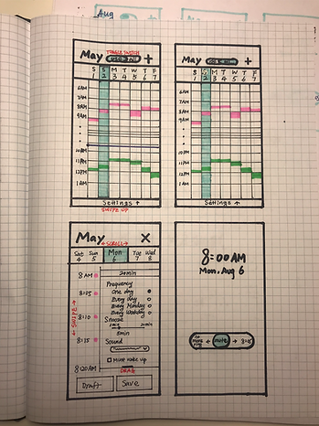
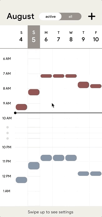
Calendar View

Alarmen provides a calendar view home screen so users can:
-
View alarms on a weekly basis
-
Add/edit an alarm by pressing on a certain time box on calendar
-
Differentiate AM and PM
-
See inactive alarms separated with active alarms
2
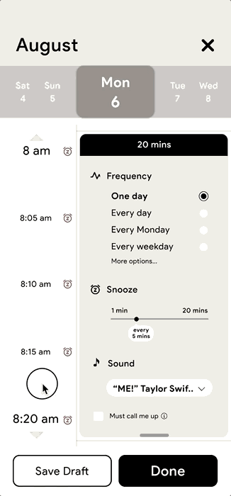
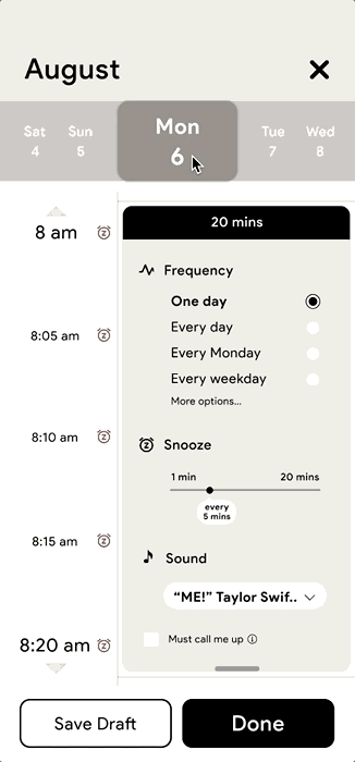
Config Settings
Frequency

When setting up a new alarm, users can modify the frequency by click on one of the radio buttons.
The time banner will change accordingly
3

Snooze and Sound
-
Snooze duration: click on the scale to select any time from 1 min-20 mins. After they selected a certain duration, the time axis will change accordingly.
-
Sound: click on the drop-down menu to change different songs
-
Must wake up mode: check the checkbox or click on the information icon to learn more
3
Edit Time or Duration
-
Change start time: swipe the time axis to change the start and end time
-
Change duration: zoom in and out the time axis to shorten/increase the time duration, or drag up/down the bottom of the card.
-
Change the date: swipe/click on the date
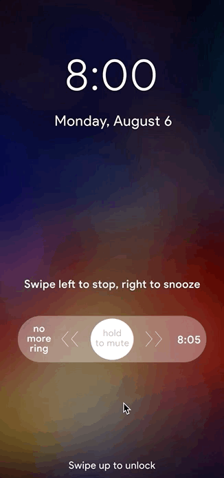
3
Snooze and stop naturally
-
Disable future rings: swipe left to disable all future rings
-
Snooze: swipe right to activate the next ring
-
Mute: hold the button to mute the current ring temporarily when undecided

-
Change between "no more ring" and the next ring if there's an error
-
Change between "no more ring" and the next ring if there's an error
Prototype
Add a new alarm (edit frequency/snooze duration)
Add a new alarm (change date or time)
Snooze and Stop
Sketches & Drafts
1
The change of the snooze / stop feature
I learned to not be afraid of jotting down any early-stage wireframes because design questions will follow only when the design being specific (e.g., specific CTA, copy, navigation, etc.).
For example, when I was designing snooze and stop CTAs, the first 10 sketches didn't get me too close to the final design. However, it brought me 2 questions.
Question 1. When users are being alarmed, is it a need to disable some of the future rings in the same series? (e.g., the next coming rings = 8:05, 8:10, 8:15, 8:20, there may be some needs to turn off the 8:15 one and keep the rest turned-on?)
After a self-experiment, I realized that users cared more about the next coming ring than the other ones. Providing too many options would make the screen distracting and hard to follow. So I decided to focus on providing a CTA to disable the next coming ring and get rid of unnecessary CTAs for the future rings.

Sketch to get the inspiration (even if ugly!)
Question 2. How to minimize the confusion and errors to snooze and stop?
After narrowing down and focus on the next ring only, here came the second question which was how to visualize the snooze and stop CTAs to minimize errors that users could make.
The initial thought was to clarify the outcome of clicking on each CTA by rewording the copy. However, it requires too much mental effort for users to read. How to provide more HINTS on the connection between two CTAs to minimize the confusion and error?


The second design was to provide some hints on moving the current ring from NOW to 8:05. I designed a slider to change the current ring from 8:00 to 8:05, indicating the current ring is disabled and the next coming ring is activated.
In addition, I designed another option on the other side of the slider to disable the current ring. In this way, snooze and stop CTAs are connected by the timeline slider which is easier for users to learn.
In the third design, I changed the orientation of the vertical slider to be horizontal to adapt to the user's reading habits.
In addition, I added new functionality - hold to mute the current ring before making any choice to provide users more time to make decision.


In the final design, I integrated the instruction inside of the slider and added additional explanations to make it learnable for first-time users
2
The change of the alarm setting
In terms of the way to set up the alarm, I focused on to solve the following question.
Question 3. How to minimize the efforts to set up the alarm?
To reduce unnecessary clicks/scrolls, a good way is to present all options upfront and provide proper ways to choose. I then broke down it into 2 sub-questions.

Question 3.1 How to minimize the clicks/scrolls to set up the time and date?
Originally users have to use the time scrollers to set up the time. However, scrolling up and down or zoom in and out maybe an easier way because it is a simple app and we have a lot of space to afford.
-
Instead of using time scrollers to set up the start/end time, it's much easier to present the timeline upfront and allowing users to scroll up and down to find nearby time slots because users usually need to find a nearby time only.
-
Another challenge is how to edit the time duration (e.g. to extend from 20 mins to 30 mins) because the length of the timeline is fixed. I finally decided to add a feature for users to zoom in/out the timeline to extend/reduce the duration because it is learnable to make all time-related gestures in the same place.
Question 3.2 How to minimize the clicks to set up the frequency, snooze duration, and the sound?
For all other configs, I listed out the range and options first and then applied certain selection controls based on the usage context.
-
Provided radio buttons for 4 frequency options to limit the user’s choice to just one option from the range provided.
-
Provided a slider for editing snooze duration to allow users to set a specific value without typing.
-
Provided a dropdown menu to select music or sound from the database.
-
Provided a checkbox to initiate the must-wake-up mode with an information icon for first-time users to click and learn about it.

3
Wireframes